
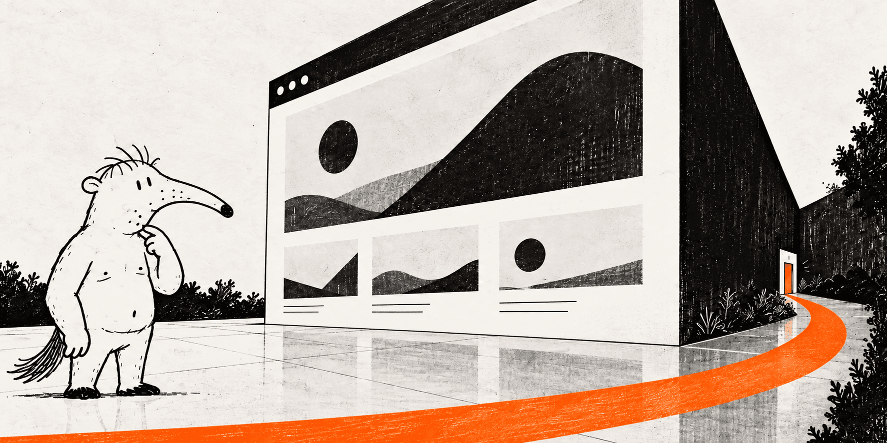
A website can win design awards and lose customers. Visual quality earns attention, but attention is only the beginning. A visitor still needs to understand the offer, believe it and know what to do next.
When a beautiful site underperforms, resist the urge to immediately redesign it. First identify where the decision journey breaks.
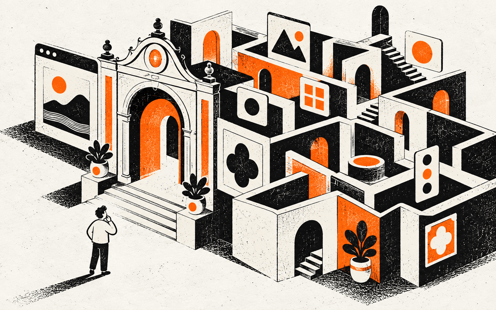
The first screen answers the wrong question
Companies often open with a slogan about themselves. Visitors arrive with a more practical question: ‘Is this relevant to me?’ The first screen should connect the audience’s situation to a clear outcome, then provide a credible next step.
- Say what you do in concrete language
- Make the audience or use case recognisable
- Show one primary action
- Remove competing messages from the first decision
The page has information but no argument
Sections are not a story merely because they follow one another. A converting page builds an argument: problem, promise, mechanism, proof, offer and action. Each block should resolve the doubt created by the previous one.
If visitors must assemble the logic themselves, most will leave. Structure is not decoration; it is guided decision-making.

Claims arrive without proof
Words such as premium, innovative and individual have little value without evidence. Replace generic claims with specific outcomes, cases, numbers, process details or demonstrations. Place proof near the claim it supports instead of hiding all credibility in a distant portfolio section.
- Relevant case studies
- Specific before-and-after outcomes
- Client names, testimonials or independent signals
- A visible process that reduces perceived risk
The action asks for too much, too early
‘Book a call’ can feel expensive when the visitor still has basic questions. Match the call to action to readiness: view relevant work, estimate scope, take a diagnosis or send a short brief. A smaller first commitment often creates more serious conversations later.
Mobile is treated as a smaller desktop
On a phone, hierarchy, speed and thumb reach become part of the offer. Oversized headings, decorative motion and hidden controls may look expressive on a large screen but turn the mobile journey into work.
Measure the real path: loading, reading, comparing, completing a form and returning after an interruption. Conversion lives in these details.
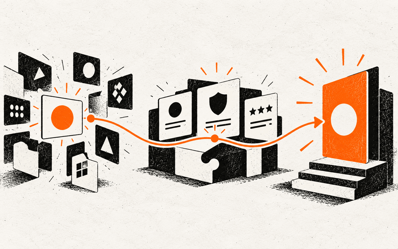
What to measure before redesigning
Combine analytics with observation. Traffic volume alone cannot explain hesitation. Review the source of visits, scroll depth, exits, form completion and actual sales conversations. Five recorded user sessions can reveal more than another week of visual exploration.
- Conversion by traffic source and device
- Drop-off between key sections or steps
- Repeated questions from prospects
- Time to complete the primary action
The goal is not to make a website less beautiful. It is to make beauty support comprehension, trust and action. Fix the decision path first; then use design to make that path unmistakably yours.